 clovercoder
Ready-made UI parts for agent apps
shadcn/ui components for agent UIs: composer, tool steps, diff view, context ring, reasoning panel.
deeplethe/solid-glass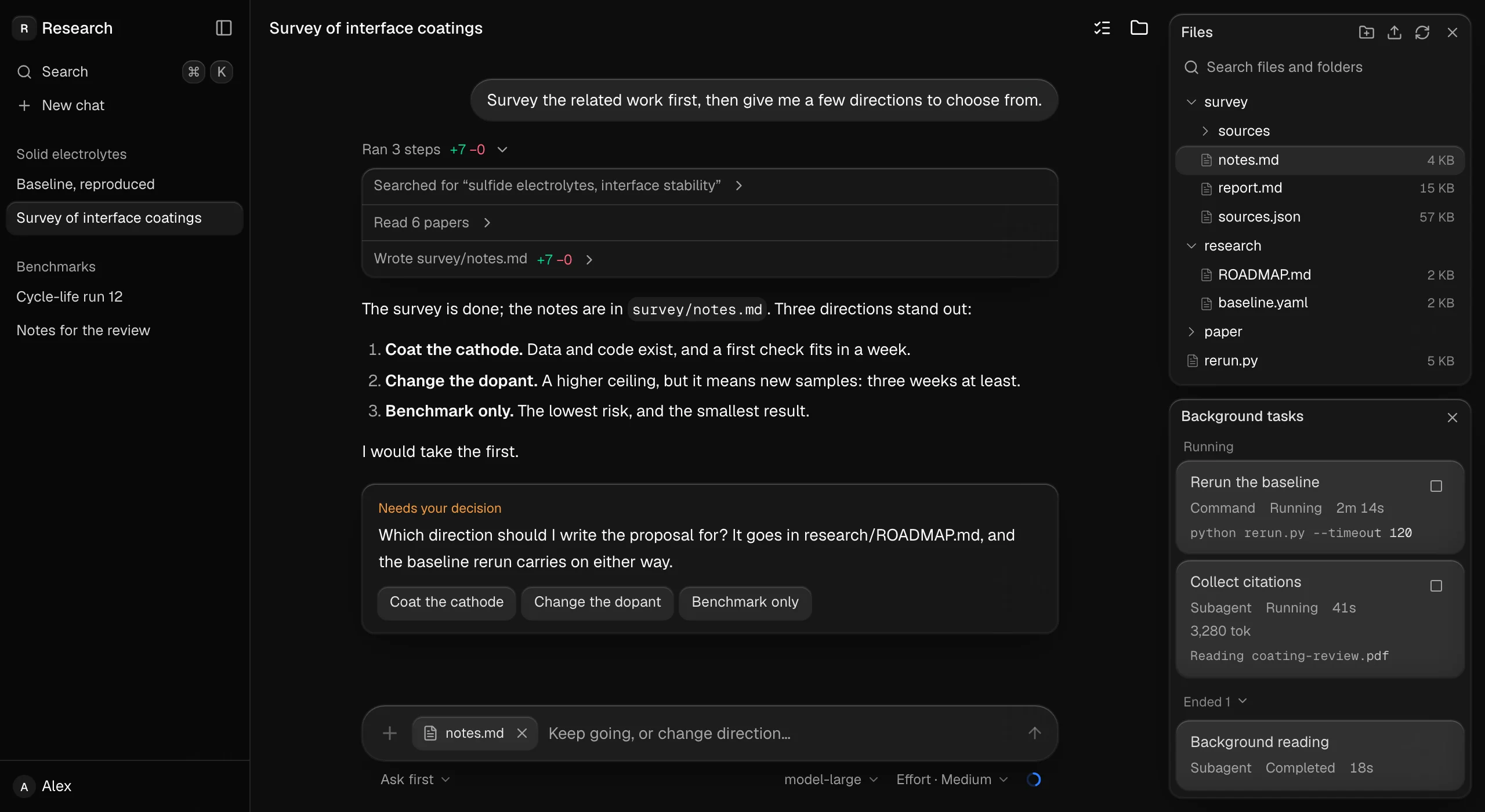
Solid Glass is a design system for AI apps, built as a theme for shadcn/ui. It sits between flat design and the liquid glass look. Surfaces get fine edge highlights, thin borders and soft shadows. From a distance they look solid, and up close the text stays readable. It also ships components made for agent interfaces, which most UI kits still don't have: a composer, tool steps, a diff view, an ask card, a context ring, reasoning blocks, turn status, task notices and a dot loader.
How it works
The core is one lightweight stylesheet, src/solid-glass.css. You don't rewrite your components. Solid Glass finds each part of a shadcn/ui component through its data-slot attributes and the classes it already has, then styles it. Your existing buttons, cards and inputs pick up the material in light and dark mode without any changes.
The README lists four principles: tactility, precision, physicality and materiality. In practice, depth comes from thickness, shadow and spatial hierarchy, not from blur. Dark mode is the look as designed. Light mode is also supported.
There's also a Create page where you can adjust the style, plus example blocks such as a full agent workspace screen.
Try it
You need a shadcn/ui project on React 19, Tailwind CSS 4 and the Base UI components.
npx shadcn@latest init
npx shadcn@latest add deeplethe/solid-glass/solid-glass
npx shadcn@latest add deeplethe/solid-glass/status-glyph
@import "tailwindcss";
@import "tw-animate-css";
@import "shadcn/tailwind.css";
@import "./solid-glass.css";Import the stylesheet after Tailwind and shadcn. Then delete the :root and .dark color variables that shadcn init wrote, because Solid Glass defines the same names.
My take
The smartest call here is targeting data-slot. A theme that needs no changes to your components is one you can try in an afternoon and remove just as fast. The agent components matter just as much. Anyone who has built a chat UI with tool calls knows how much time goes into tool steps, diffs and "the model wants to ask you something" cards. Getting those prebuilt and styled to match saves real time.
The limits are clear too. It's tied to a specific stack: shadcn/ui, React 19, Tailwind 4, Base UI. If you're on Radix-based shadcn or something else, the README doesn't promise it will work. Deleting your color variables also means you're adopting their palette, not just layering on top of yours. And because it's a strong visual style, your app will look like Solid Glass, not like your brand.
If you're building an agent frontend on a current shadcn setup and don't want yet another generic chat look, it's worth trying. It's MIT licensed.